Skooldio's UX/UI Bootcamp Case Study
delifresh
Fresh groceries hand-picked by professional shoppers deliver straight to your doorstep
Skooldio's UX/UI Bootcamp Case Study
Fresh groceries hand-picked by professional shoppers deliver straight to your doorstep
Delifresh is a mobile application that aims to deliver fresh groceries to people who have busy lifestyles. With our highly-experienced shoppers, they can shop for their groceries with ease and comfort at home. All items will be delicately selected and handled with good take care from the market to their doorsteps.
Duration: May 2022 – August 2022
Role: UX/UI Designer
Approach: Design Thinking
Tool: Figma


In the first week of the Bootcamp, I teamed up with 4 classmates. We were assigned to do a project related to e-commerce. Our stakeholder was a fresh market owner. She saw a decrease in customers and stated that they didn’t want to go to the market because of the Covid-19 pandemic. Besides, fresh produce at the market was perceived as low-quality and not-so-fresh. Some customers couldn’t complete their shopping lists because they couldn’t find the right size or quantity of the item they wanted to buy, making them seem unsatisfied. By creating an application that provides delivery service and shopping assistant, stakeholder believed that the problems can be solved.
Our stakeholder set her goals as followings:
— To expand sales channels of the merchants
— To deliver good quality products to the customers
— To be a service to the marketplace and be able to expand this service to other fresh markets in the future
After interviewing with stakeholder, I analyzed the problems and goals of our stakeholder and came up with a research plan. It aimed to get a better understanding about the business (how people sell and buy), and target customers. In the research, the qualitative methods: interview, shadowing, and desk research were used.
— Fresh Market is a large marketplace that contains so many stores.
— There are various types of customers, ranging from individuals to restaurants. In this project, household purchases or retails will be primarily focused on.
— Same kind of product might be different in price depending on each store, quality, and freshness. So, having experience in selecting is a must.
— The price of meat, seafood, and fresh produce such as head vegetables, root vegetables, depends on the actual weight.
To understand the target customers which will be introduced as our ‘users’ from now on, my teammates and I conducted interviews with 7 participants. We aimed to gain insight into their perspectives on fresh market, cooking and shopping experience during the pandemic, behaviors, motivations, rationales behind any decisions they made, and problems they experienced. So, we brainstormed and then came up with these guiding questions:
— How often do you shop for your groceries?
— What factor do you consider when making the decision where to shop?
— How do you select your ingredients for cooking?
— Can you tell us about your latest experience with food delivery application?
— From your perspective, what makes online shopping and traditional shopping a difference?

To delve deeper into the product quantity that the user want to buy, I did some more research using shadowing method to observe people behaviors during their shopping. I discovered that people normally pick some product type like carrot, onion, and mango in each. When those products come in pack that contains the exact quantity and fixed price, it exceeds the quantity that the users want to buy.
In the define stage, I used customer journey map to better understand users’ experience, address their pain points and needs, then analyzed which phase of the journey that could be improved.
_resized.png)
From user research and customer journey map, it enabled me to identify users’ demographics, behaviors, pain points and needs, including potential solutions. I divided them into 2 personas with different backgrounds and behaviors. These helped me to keep in mind that I was designing for the real users and tackling the real problems throughout the rest of the project.

Primary Persona: Jingjai, a 28-year-old engineer, who enjoys cooking and very selective for her food ingredients. With a busy lifestyle, she has no time for shopping and avoids going out during the pandemic. Ordering fresh groceries through food delivery applications doesn’t seem to be satisfying for her. She frequently did not receive what she ordered because the item was out of stock, and the entire order was cancelled, making she felt disappointed and reluctant to order fresh groceries from online platforms.

Secondary Persona: Jay, a 33-year-old graphic designer, who typically cannot cook, but he learned to cook for himself during the pandemic. He believes that delicious dishes require the best quality of ingredients, but he finds it is difficult to choose proper ingredients for each menu.
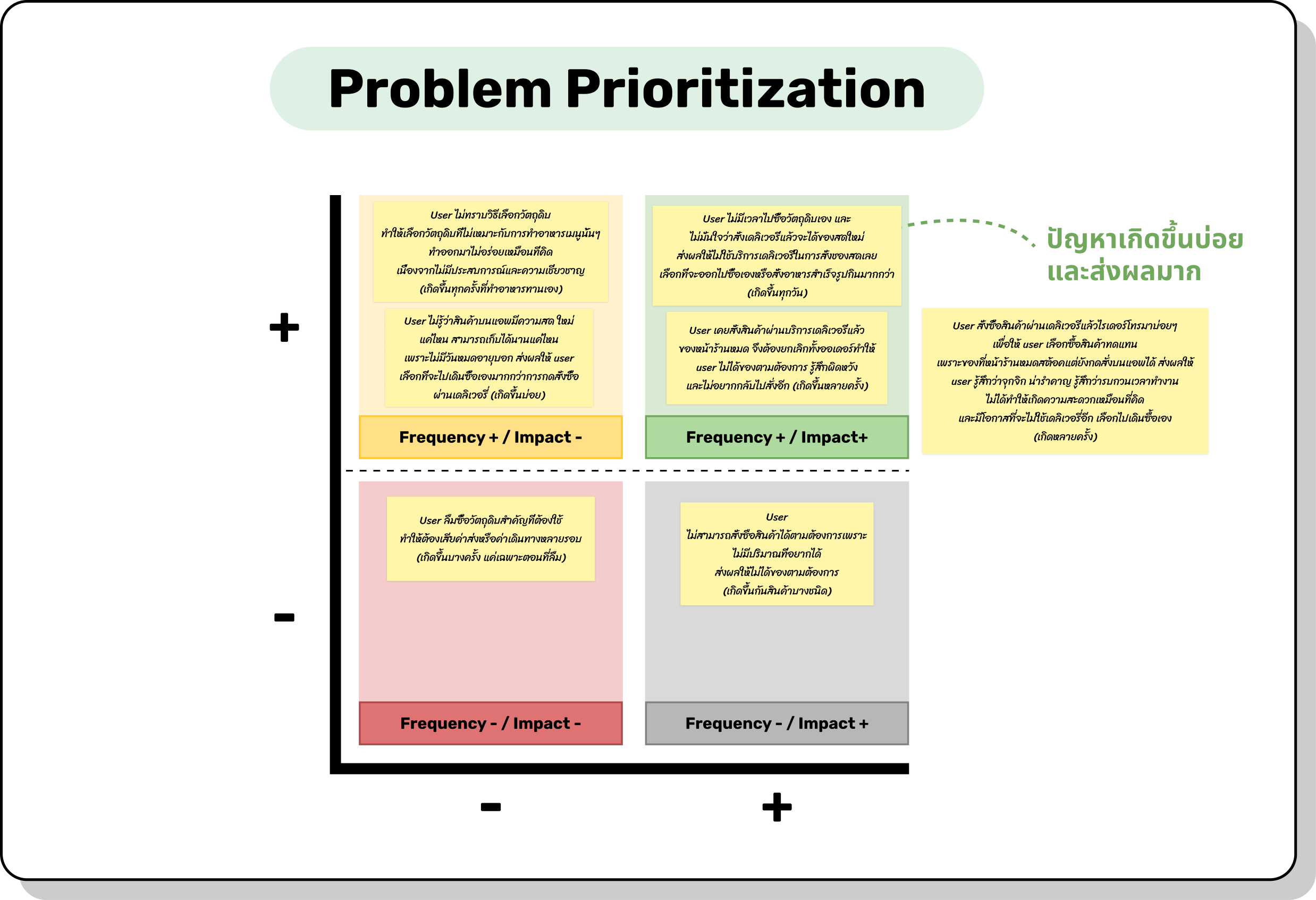
After defined pain points and needs of 2 personas, I wrote problem statements and applied on problem prioritization matrix. These helped me decide which problems most frequently happened and value high impact.
How Might We (HMW) questions were used to quickly generate broad ideas for possible solutions of high impact and frequently occurring problems.

The hypothesis statements were created based on the ideas generated with HMW as followings:
I conducted competitive analysis to analyze competitors in the same market and see what they offer to the users, including the strengths and weakness of their products. This helped me elevate idea for functions or features that could possibly solve the problems.

To quickly identify the main tasks that users have to do to achieve their goals, I built low-fidelity wireframes by sketching out important element with paper and pen.

From the low-fidelity wireframes, I used Figma to build mid-fidelity wireframes that visualized more details

To point out the paths that users will take to archive their goals, I created a user flow in the form of a flowchart. This also gave me an idea for other pages that needed to design.
_resized.png)
To see the bigger picture, I integrated a service design blueprint that depicts how users, tech, and staff involved throughout the customer journey.


The products are divided into categories and stores. Users can easily navigate the stores that sell the desire products. With shopping by store, this can be another sales channels of the merchants which will enhance an increase in sales directly.
To inform shelf life of the product, it will be useful for the users to predict how long this product can be kept.

Allow the users to shop in each and calculate price from the actual weight


Users can select a replacement option to replace the sold out item in advance. With this solution, it will reduce the chance of being disturbed by numerous phone calls from the riders.
.png)
In one order, users can buy products from multiple stores in the same market without paying any additional fees, giving them more options while also saving money.


With the busy lifestyles of our users, they can choose date and time for the delivery upon their convenient.


With shopping activity updates, users can track their order status real time.
By providing a highly-experienced shopper, the users can trust that all items will be carefully chosen and handled with care from the market to their homes.

Users can provide feedback on the order and delivery services. This can help us improve the experience by measuring their satisfactions with our application.


This is a journey that I have undertaken to enhance the user interface of Delifresh.
ExploreSince this is my first step in UX design field, I have encountered numerous challenges and learned a lot about UX process throughout the project. With learning by doing, my skills and techniques in UX and UI were constantly developed. Here are my key takeaways.
Keep the users in mind
Any design decision must be made with the needs and pain points of the users in mind. When having a question or unsure about anything, ask the users.
Set research goals before conducting
It is very crucial to set research goals before conducting the research, especially user research. When working as a team, goals will be the main guidance of how we conduct the research, the method we apply, and the questions we ask. With no goal, you get nothing from the research.
Avoid leading questions during user interviews
The purpose of an interview is to understand users, not to validate thoughts of the interviewers. Asking leading questions can decrease chances of getting valuable insights from the users.
Conduct Usability Testing to prove design decision
Initially, I was struggled with the thought of perfect wireframes. I created a lot of versions and kept adjusting because I couldn’t decide which version that actually works best. From this project, I learned that there is no perfection in UX and UI. To prove your design decision, you need to conduct usability testing with the users and iterate it. If I could have done differently, I would run the testing before building hi-fidelity wireframes.
— Conduct usability testing and iterate
— Design screens for empty stages and error cases
Images: Unsplash, Freepik
Icons: Material Symbols, The Noun Project
Illustrations: Freepik and Khushmeen
Thank you for your time exploring my project 'Delifresh.'
If you would like to know more about the project or have any questions, don't be hesitated to get in touch.
My contact information is provided below.
Kanyanut Kesornsombut
kanyanut.kess@gmail.com
(+66) 65 928 8203